
Pickles
I founded Pickles as an independent magazine exploring football through its stories, history and visual culture. As creative director, I shaped its editorial approach, commissioned contributors and designed its identity. This next chapter explores how that foundation can extend across stories, community and projects, in print, online and beyond.


The name comes from Pickles, the dog who found the stolen World Cup trophy in 1966. That unexpected footnote in football history captured the spirit I wanted for the magazine. I developed the dog into a geometric mascot, refining its silhouette, angles and line weights to balance precision with personality. The resulting mark retains its character across scales, from a small embroidered detail to a flag.


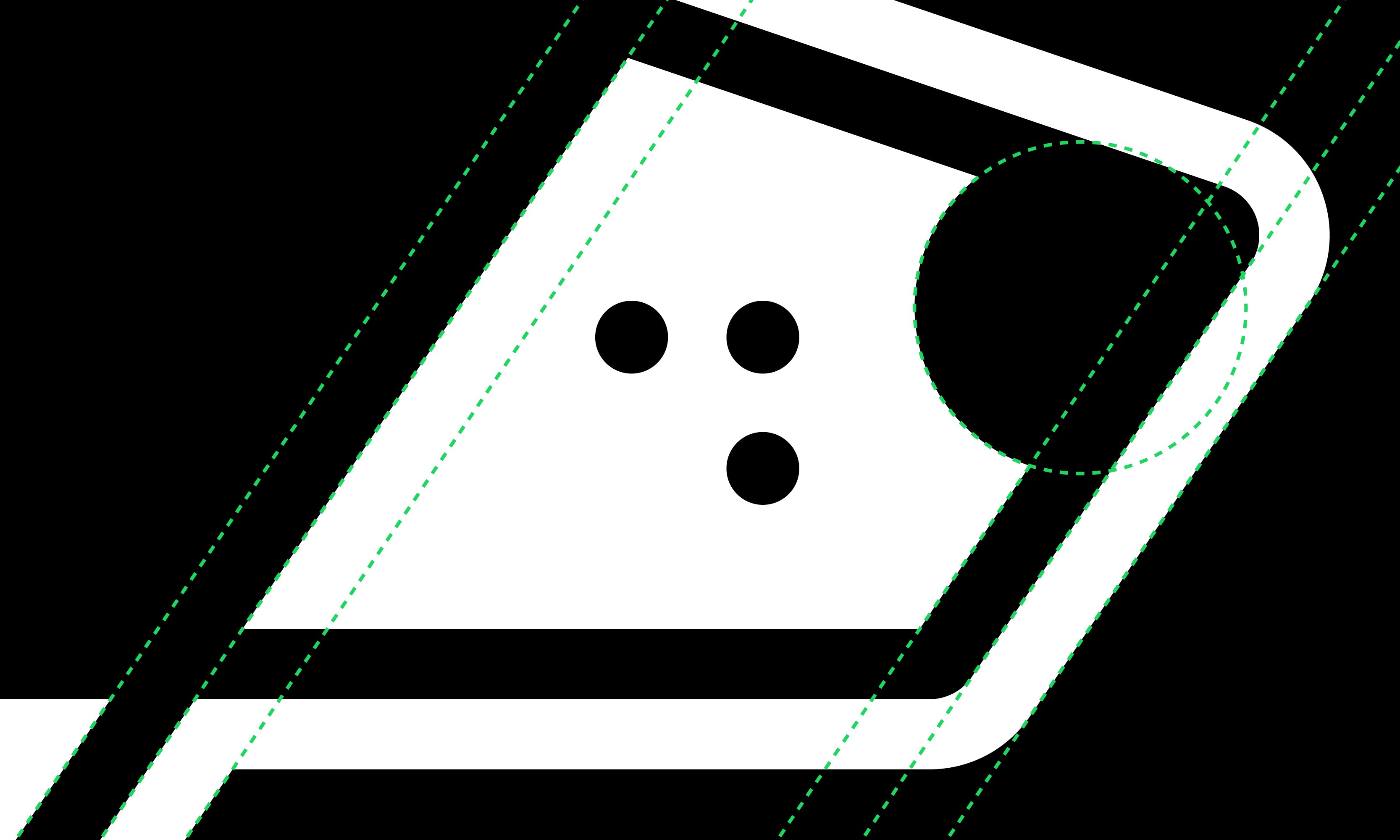

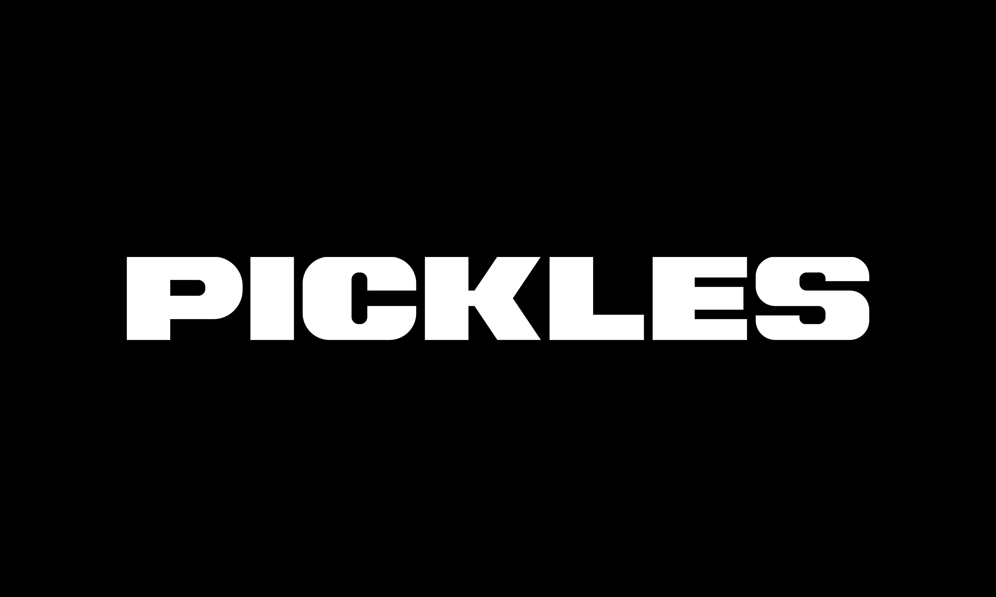
I designed a custom wordmark around the dog symbol’s geometry, carrying its angles and proportions into the letterforms. The aim was a recognisable name with enough character to stand alone, while working alongside the mascot on magazine covers, digital content and clothing.


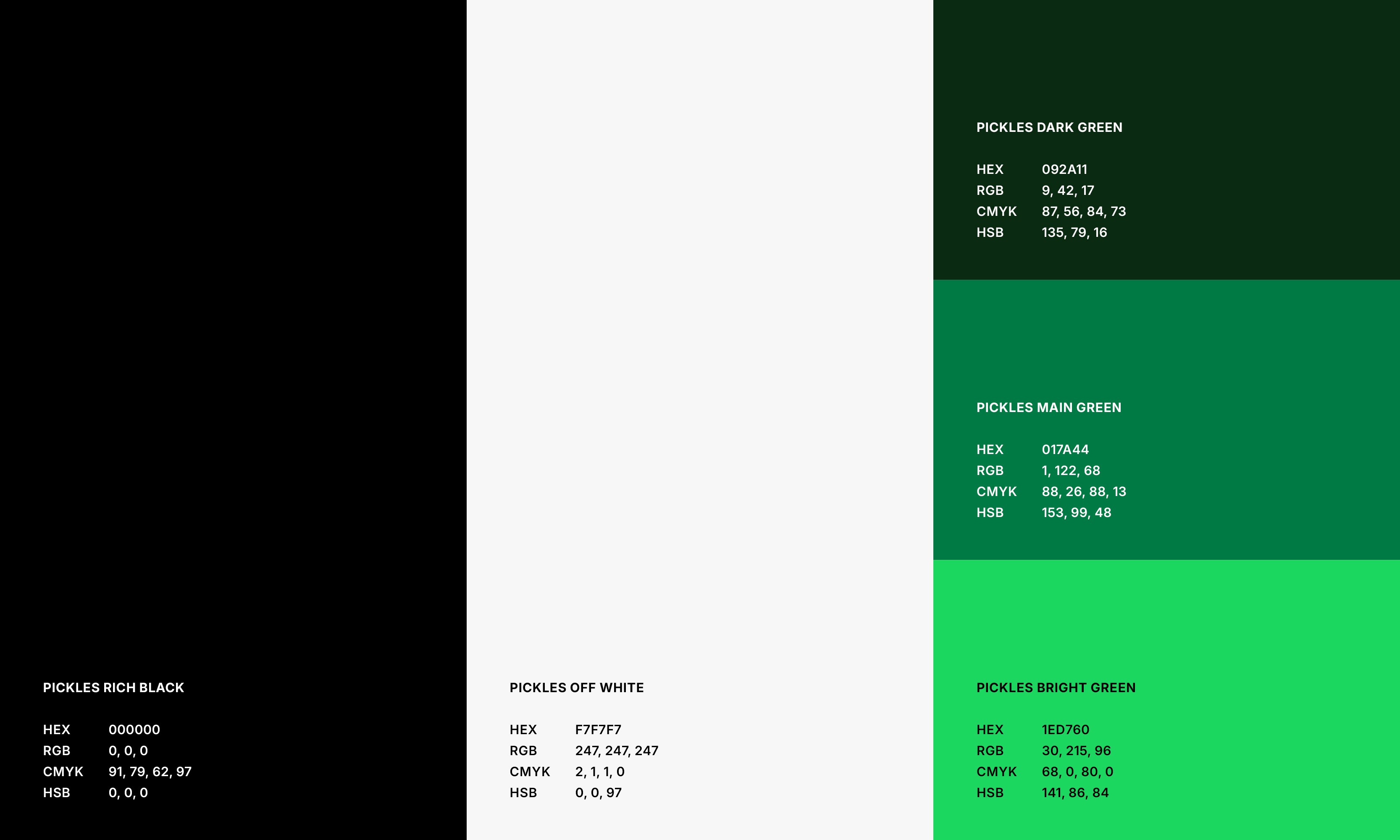
I retained Pickles’ black-and-white foundation and introduced three greens to broaden its expression while keeping a recognisable core. PP Formula Condensed Black brings weight and energy to headlines, carrying the magazine’s expressive approach to typography into digital stories, social content and product applications.
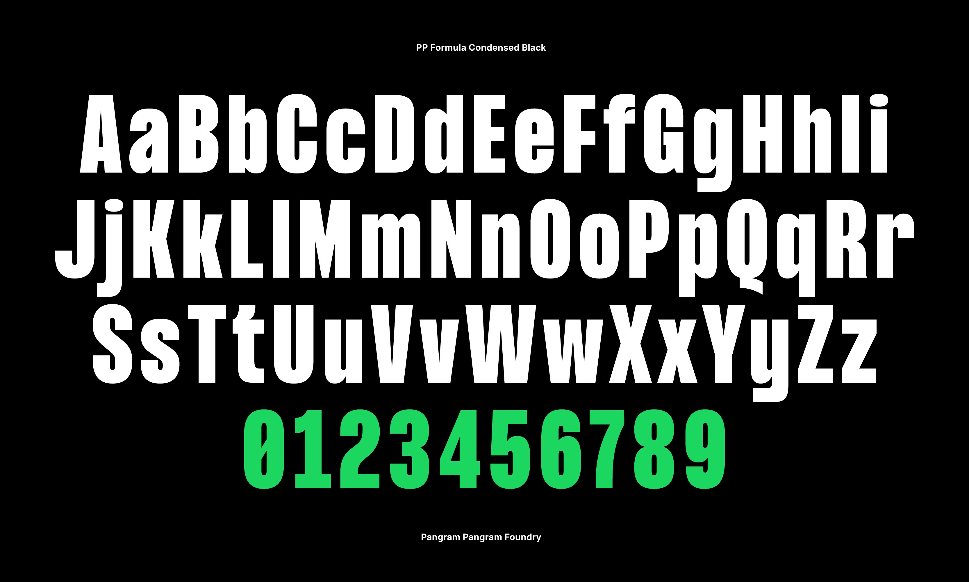
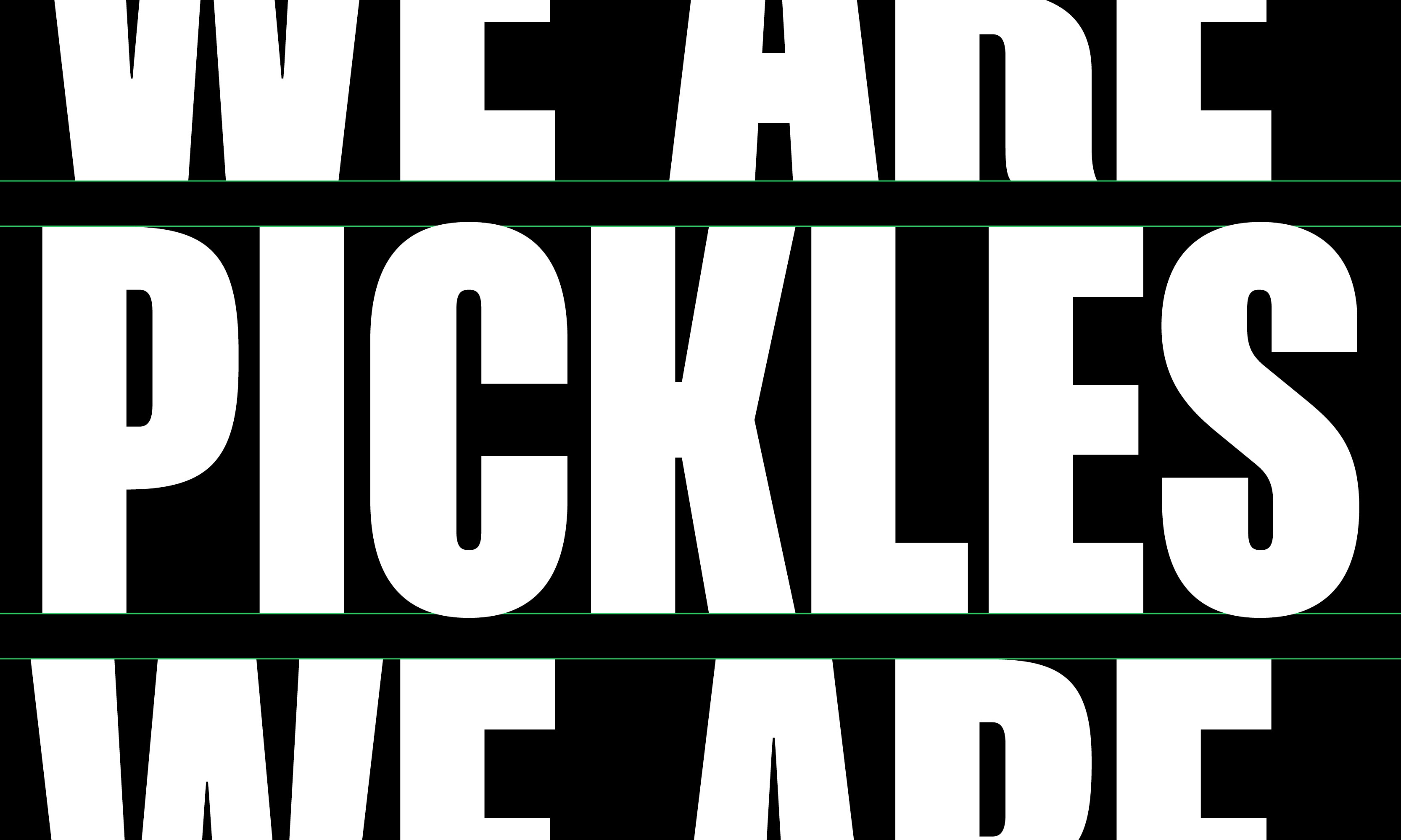
I brought the typography, colour and graphic elements together across editorial and social applications, creating a consistent identity that leaves space for individual stories, photographs and illustrations. A quieter supporting typeface balances the condensed headlines, giving longer stories and practical information room to breathe.
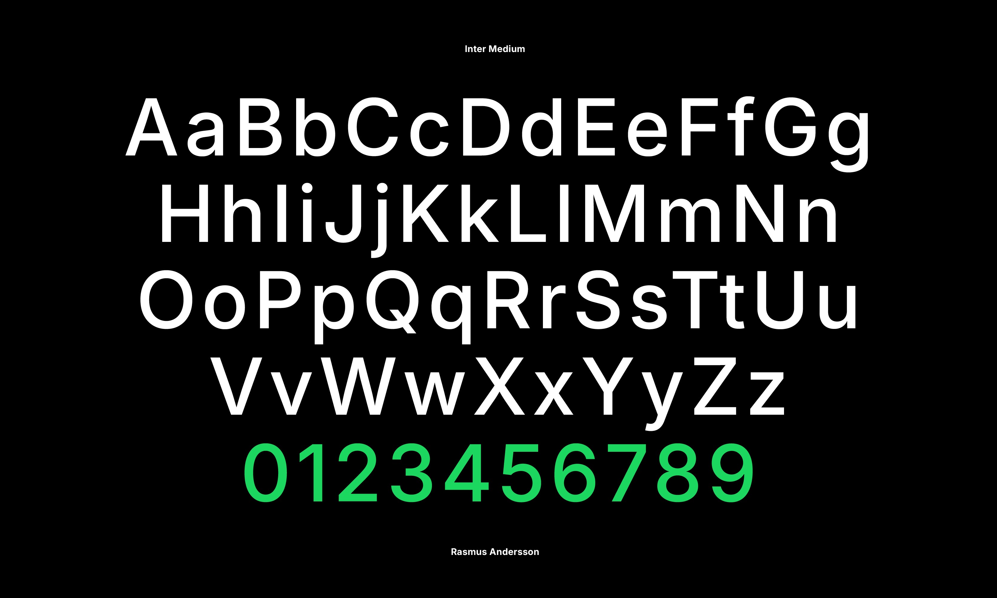


I built the pattern from the dog symbol’s angular forms, drawing on the graphic football shirts of the 1990s. It gives Pickles a way to express its identity beyond the logo, connecting the branding to the visual culture of the game through applications on shirts, packaging and larger surfaces.


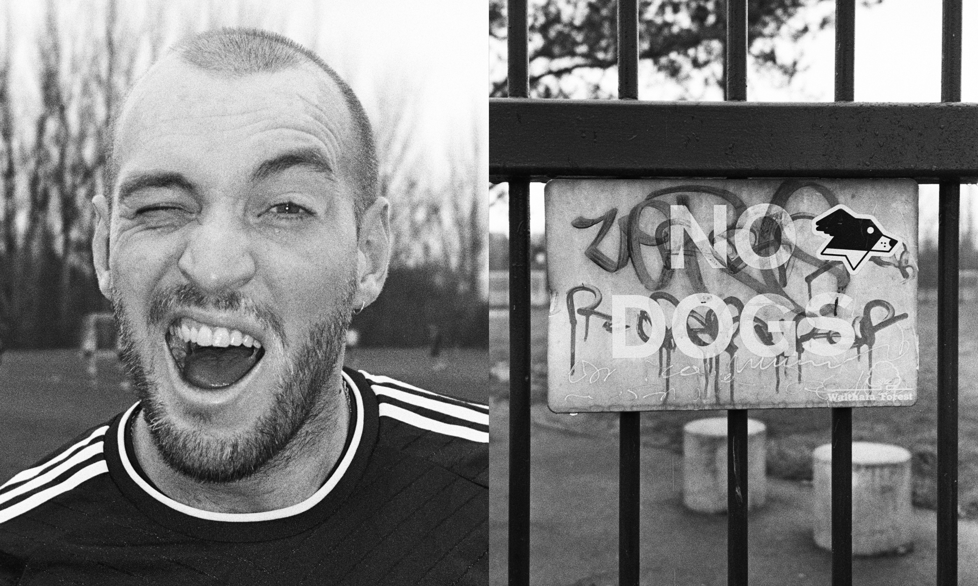
I photographed the people, places and everyday moments around Pickles on black-and-white film. The informal portraits and details of the game bring a personal perspective to the project, reflecting the friendships and shared experiences around football. Alongside the graphic identity, they help establish a photographic approach grounded in the people involved.




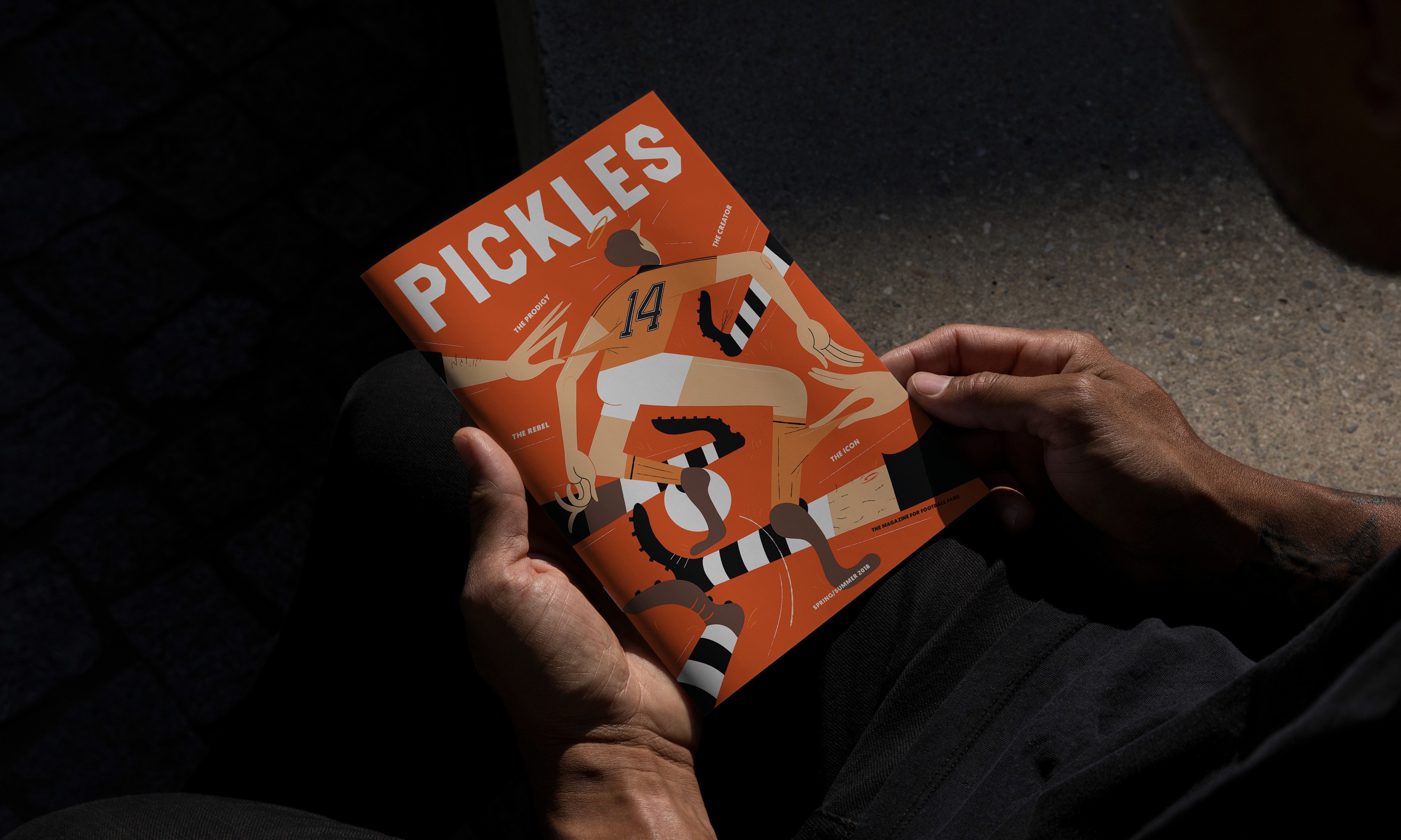

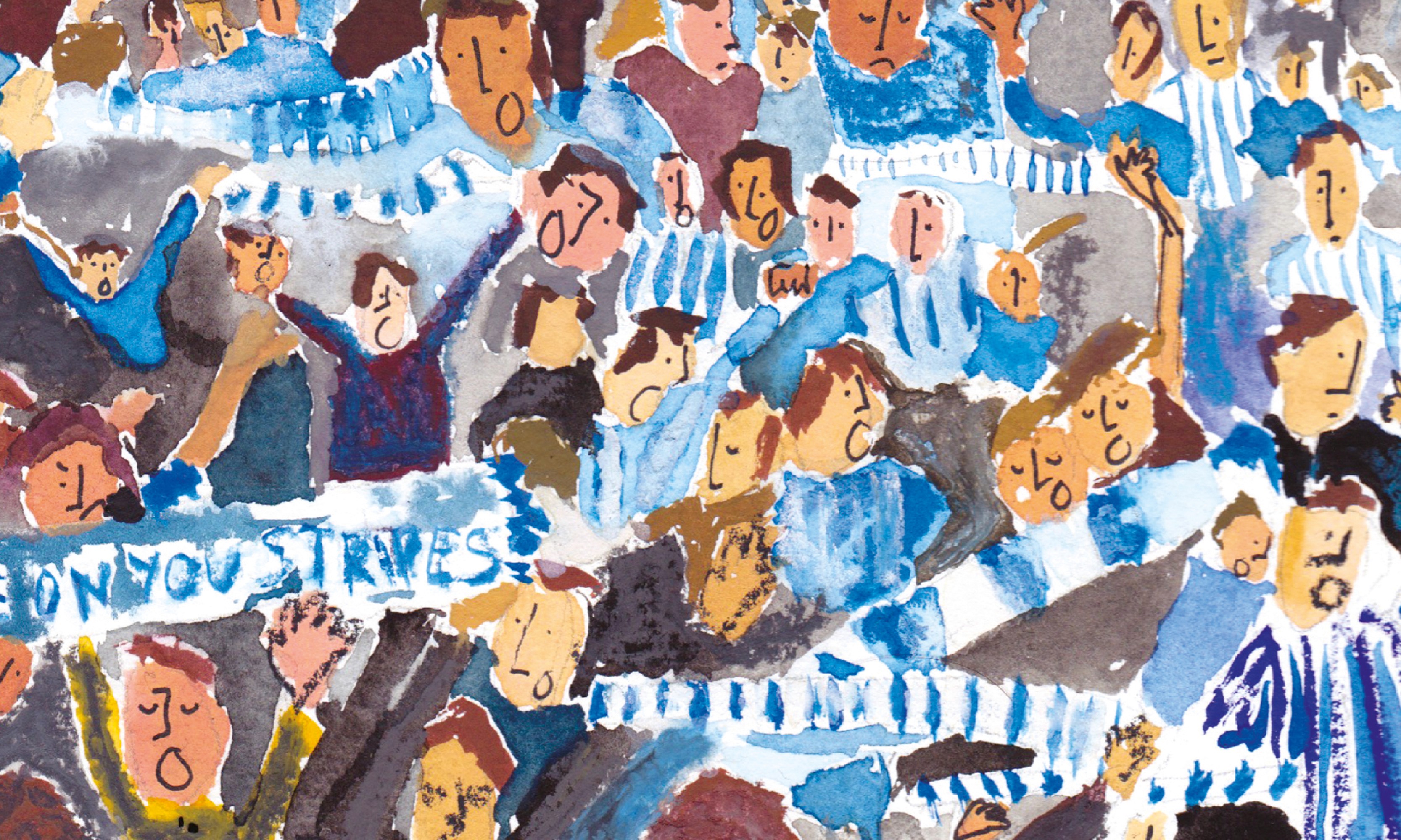
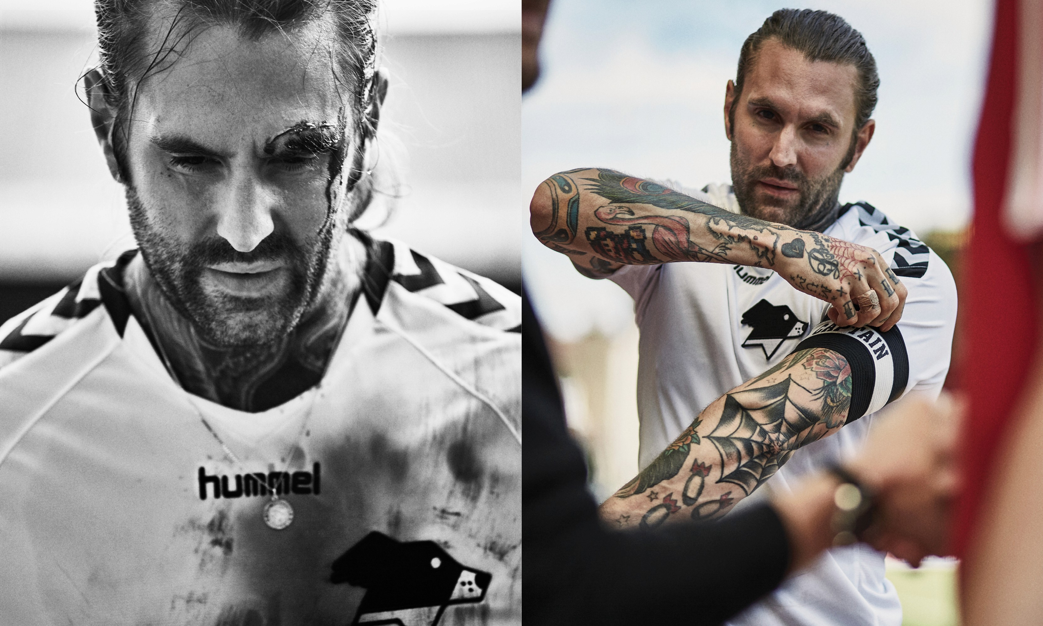
The ambition for Pickles is to bring people together through a shared appreciation of football and its culture. Stories, Community and Projects provide a framework for that next chapter, with the freedom to choose the form each idea deserves. The identity supports this ambition across publishing, digital experiences, collaborations and products.


